Progress
Show how far along a task is.
Show how far along a task is.
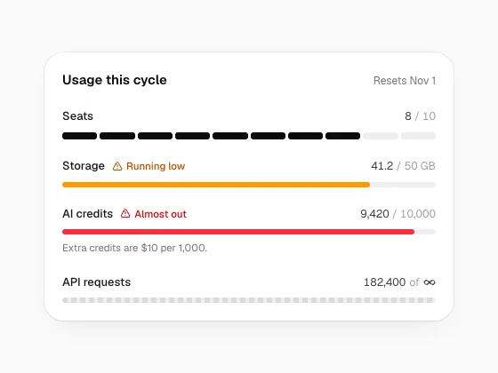
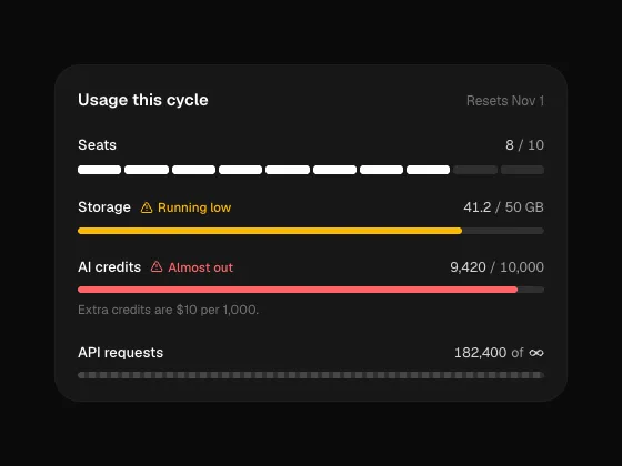
How much of a limit is used: a bar, a ring or one block per seat, turning amber when running low and red when almost out. Unlimited plans show a dashed track. Includes a credit balance card.
motion · lucide-react
Three limits as rings with the percent inside.
A sidebar card in each state, with a top-up button.
Healthy, running low, almost out and used up.
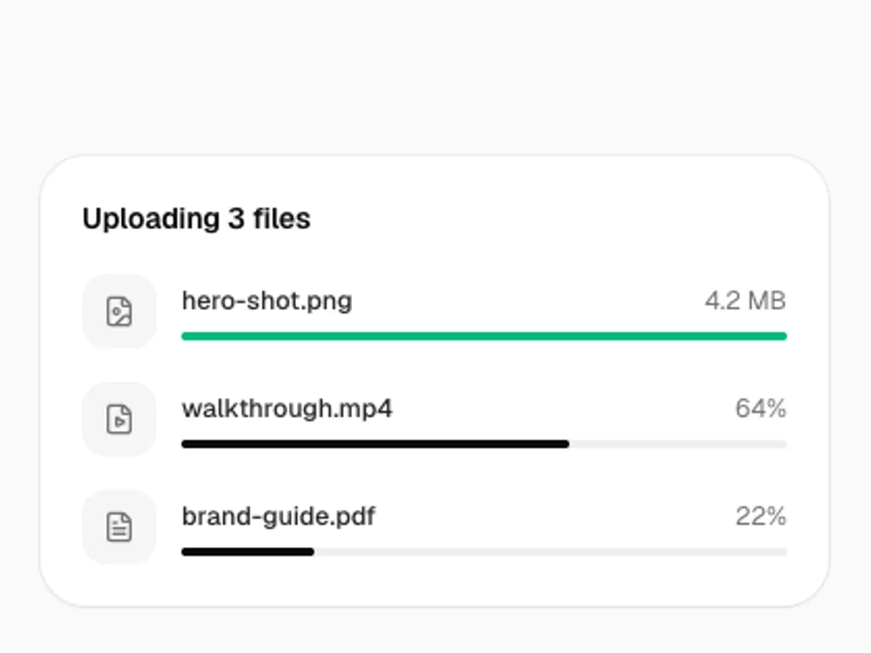
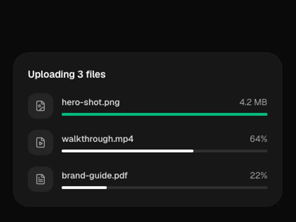
Progress as a bar, segmented steps, a row of tall bars or a ring, with tones, sizes, per-bar colors, an indeterminate state and a spring that eases to each new value.
radix-ui · motion
The fill springs to each new value.
A label and value above the bar.
variant="segmented" for steps, filled one by one.
variant="bars": a row of tall pills that fill from the left.
barTones colors single bars, for a status history.
variant="ring" with showValue for the percentage.
value={null} when the total isn't known.
neutral, blue, emerald, amber and rose.
sm, md (default) and lg.