Scalar UI
Marketing UIApp UIAIChartsBackgrounds
Sign inGet started
Scalar UI
Scalar UI© 2026 Scalar Limited

React · Tailwind CSS · Motion

Browse

HomeAll components 213

Collections

Marketing UI 107App UI 94AI 16Charts 45Backgrounds 2Text 43

More

Text 43

Getting started

Installation

Primitives

AccordionsAlert DialogsAlerts2Aspect RatiosAvatars2BadgesBreadcrumbsButton GroupsButtons2CalendarsCheckboxesCollapsiblesComboboxesCommand MenusContext MenusDate PickersDialogsDropdown MenusEmpty StatesFields2FormsHover CardsInput OTPInputs3KbdMenubarsNavigation MenusPaginationPassword InputsPopoversProgress2Radio GroupsResizableScroll AreasSelectsSeparatorsSheetsSkeletonsSlidersSpinnersSwitchesTablesTabsToastsToggles2ToolbarsTooltipsSortablesStatus DotsTree ViewsFile UploadsSteppers

Layouts

SidebarsNavbarsApp Shells

Blocks

SchedulersBoards3CanvasesWorkflowsAI apps4Developer tools3AuthenticationOnboardingSettingsPricing & upgrades2Help & feedback4System pages7Admin console

Other

Cards

Resources

Docs & installScalar Design
App UIPrimitives

Button Groups

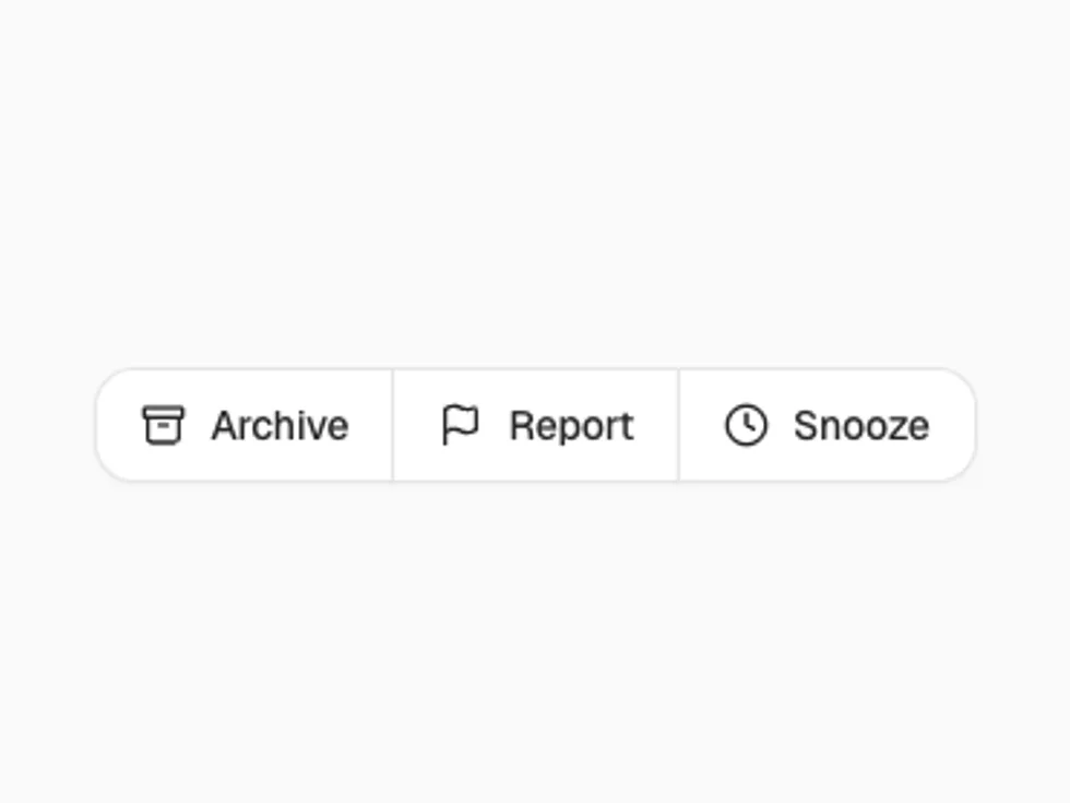
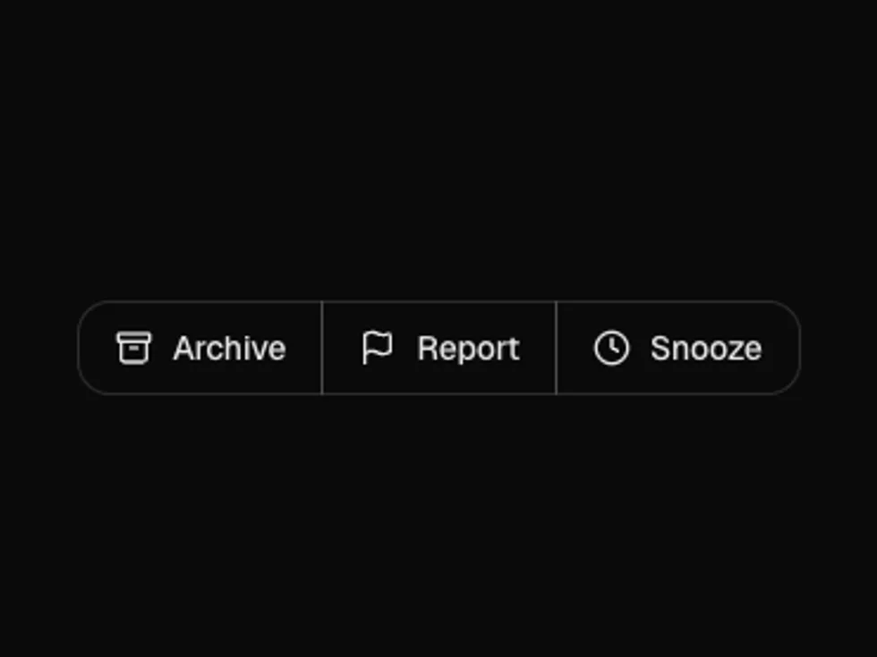
Attaches related buttons into one control, with outline, secondary and primary styles, separators and text segments.

PreviousBreadcrumbsNextButtons

On this page

DefaultSplit ButtonWith TextIconVerticalSize

Button Group

radix-ui

Default

Outline items attach with shared borders.

Split Button

A primary action with a menu of alternatives behind the chevron.

With Text

variant="secondary" with separators and a ButtonGroupText for the zoom level.

Icon

size="icon" for a formatting bar.

Vertical

orientation="vertical" for map-style controls.

Size

sm and md (default).