Scalar UI
Marketing UIApp UIAIChartsBackgrounds
Sign inGet started
Scalar UI
Scalar UI© 2026 Scalar Limited

React · Tailwind CSS · Motion

Browse

HomeAll components 213

Collections

Marketing UI 107App UI 94AI 16Charts 45Backgrounds 2Text 43

More

Text 43

Getting started

Installation

Primitives

AccordionsAlert DialogsAlerts2Aspect RatiosAvatars2BadgesBreadcrumbsButton GroupsButtons2CalendarsCheckboxesCollapsiblesComboboxesCommand MenusContext MenusDate PickersDialogsDropdown MenusEmpty StatesFields2FormsHover CardsInput OTPInputs3KbdMenubarsNavigation MenusPaginationPassword InputsPopoversProgress2Radio GroupsResizableScroll AreasSelectsSeparatorsSheetsSkeletonsSlidersSpinnersSwitchesTablesTabsToastsToggles2ToolbarsTooltipsSortablesStatus DotsTree ViewsFile UploadsSteppers

Layouts

SidebarsNavbarsApp Shells

Blocks

SchedulersBoards3CanvasesWorkflowsAI apps4Developer tools3AuthenticationOnboardingSettingsPricing & upgrades2Help & feedback4System pages7Admin console

Other

Cards

Resources

Docs & installScalar Design
App UIPrimitives

Date Pickers

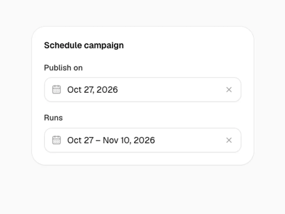
A field that opens a calendar in a popover, for one day or a range, with presets, clearing and form support.

PreviousContext MenusNextDialogs

On this page

DefaultRangePresetsQuick PicksDate of BirthIn a FormVariants and States

Date Picker

radix-ui · motion · lucide-react

Default

Click the field, pick a day: the popover closes.

Range

DateRangePicker with two months; it closes once both ends are picked.

Presets

presets lists ranges beside the calendar, e.g. Last 7 days.

Quick Picks

presets on a DatePicker shows chips under the calendar.

Date of Birth

captionLayout="dropdown" and a custom format.

In a Form

name submits the day as YYYY-MM-DD; invalid when it's missing.

Variants and States

outline, soft, sm, invalid and disabled.