Scalar UI
Marketing UIApp UIAIChartsBackgrounds
Sign inGet started
Scalar UI
Scalar UI© 2026 Scalar Limited

React · Tailwind CSS · Motion

Browse

HomeAll components 213

Collections

Marketing UI 107App UI 94AI 16Charts 45Backgrounds 2Text 43

More

Text 43

Getting started

Installation

Primitives

AccordionsAlert DialogsAlerts2Aspect RatiosAvatars2BadgesBreadcrumbsButton GroupsButtons2CalendarsCheckboxesCollapsiblesComboboxesCommand MenusContext MenusDate PickersDialogsDropdown MenusEmpty StatesFields2FormsHover CardsInput OTPInputs3KbdMenubarsNavigation MenusPaginationPassword InputsPopoversProgress2Radio GroupsResizableScroll AreasSelectsSeparatorsSheetsSkeletonsSlidersSpinnersSwitchesTablesTabsToastsToggles2ToolbarsTooltipsSortablesStatus DotsTree ViewsFile UploadsSteppers

Layouts

SidebarsNavbarsApp Shells

Blocks

SchedulersBoards3CanvasesWorkflowsAI apps4Developer tools3AuthenticationOnboardingSettingsPricing & upgrades2Help & feedback4System pages7Admin console

Other

Cards

Resources

Docs & installScalar Design
App UIPrimitives

Inputs

Single and multi-line text fields with icons, prefixes and states.

PreviousInput OTPNextKbd

On this page

Copy FieldSSO ValuesRecovery CodesInlineInputDefaultVariantsWith IconPrefix and SuffixWith ButtonPasswordInvalidSizeDisabled and FileTextareaDefaultSoftAuto-growWith CountInvalid and Disabled

Textarea

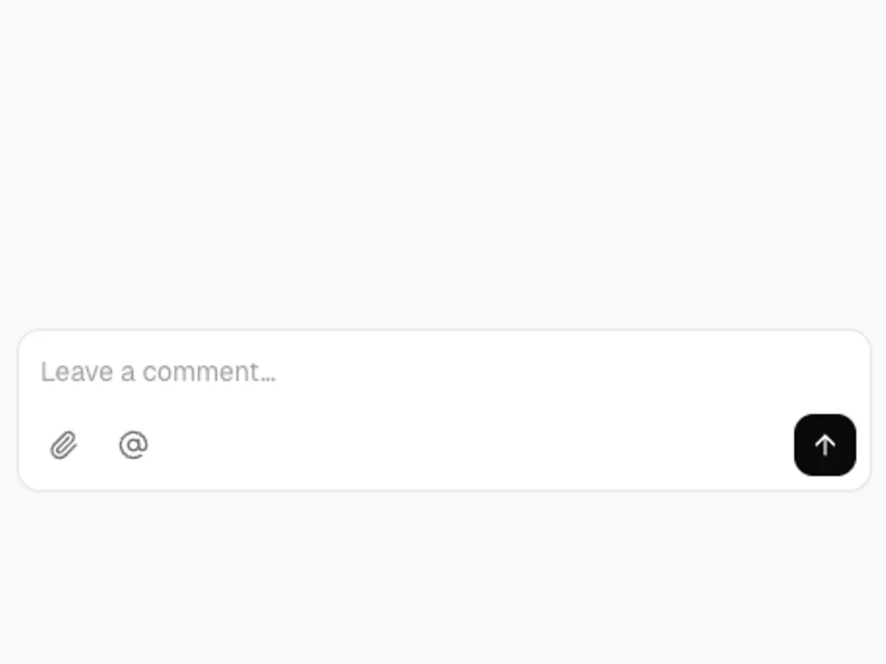
Multi-line text in outline and soft styles that can grow with its content, count characters and carry a toolbar.

Default

Three rows by default.

Soft

variant="soft": filled, no border.

Auto-grow

autoGrow grows with the text up to maxRows.

With Count

showCount with maxLength turns amber near the limit.

Invalid and Disabled

invalid with a message, and a disabled field.

Copy Field

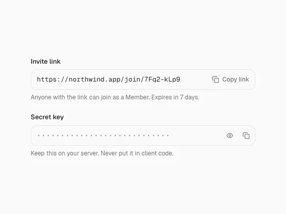
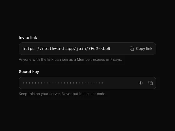
Read-only values to copy: a field with a copy button that ticks, a reveal toggle for secrets, a block of lines with copy and download, and a bare copy button.

motion · lucide-react

Input

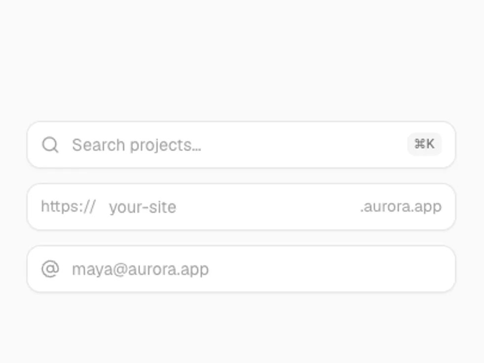
A text field in outline, soft and underline styles with icons, prefixes, suffixes, inline buttons, sizes and invalid and disabled states.

lucide-react

SSO Values

Three values to paste into an identity provider.

Recovery Codes

Eight codes in two columns with copy and download.

Inline

IDs in a list, each with its own copy button.

Default

A plain outline field.

Variants

outline (default), soft and underline.

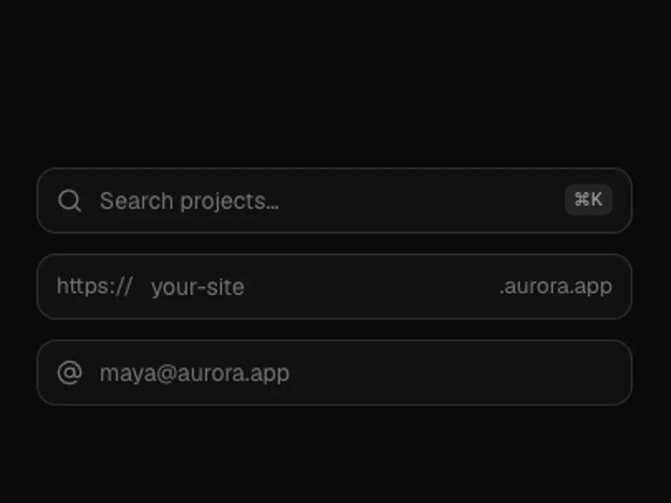
With Icon

leading and trailing take icons.

Prefix and Suffix

Text before and after the value, like a protocol or a unit.

With Button

A button inside the field, for sign-ups and invites.

Password

A show/hide toggle in the trailing slot.

Invalid

invalid tints the field; pair it with a message.

Size

sm, md (default) and lg.

Disabled and File

A locked field, and type="file" with a styled button.