Scalar UI
Marketing UIApp UIAIChartsBackgrounds
Sign inGet started
Scalar UI
Scalar UI© 2026 Scalar Limited

React · Tailwind CSS · Motion

Browse

HomeAll components 213

Collections

Marketing UI 107App UI 94AI 16Charts 45Backgrounds 2Text 43

More

Text 43

Getting started

Installation

Primitives

AccordionsAlert DialogsAlerts2Aspect RatiosAvatars2BadgesBreadcrumbsButton GroupsButtons2CalendarsCheckboxesCollapsiblesComboboxesCommand MenusContext MenusDate PickersDialogsDropdown MenusEmpty StatesFields2FormsHover CardsInput OTPInputs3KbdMenubarsNavigation MenusPaginationPassword InputsPopoversProgress2Radio GroupsResizableScroll AreasSelectsSeparatorsSheetsSkeletonsSlidersSpinnersSwitchesTablesTabsToastsToggles2ToolbarsTooltipsSortablesStatus DotsTree ViewsFile UploadsSteppers

Layouts

SidebarsNavbarsApp Shells

Blocks

SchedulersBoards3CanvasesWorkflowsAI apps4Developer tools3AuthenticationOnboardingSettingsPricing & upgrades2Help & feedback4System pages7Admin console

Other

Cards

Resources

Docs & installScalar Design
App UILayouts

Navbars

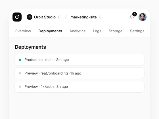
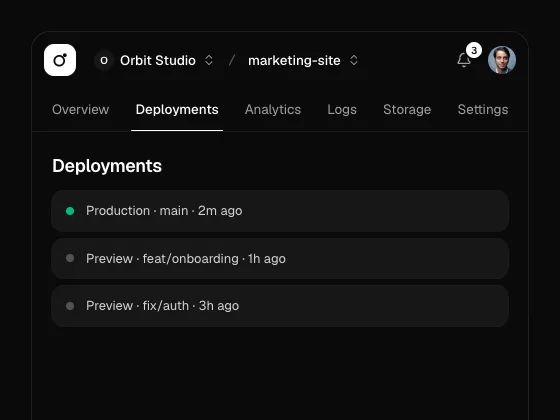
An app and site top bar: links and tabs with a highlight that glides, breadcrumb switchers, a ⌘K palette, a notifications inbox, and a floating pill that tightens on scroll, with a smooth or bouncy spring.
PreviousSidebarsNextApp Shells

On this page

SimpleBouncy TabsFloatingCommand SearchNotificationsGlass

Navbar

radix-ui · cmdk · motion · lucide-react

Simple

Logo, links with a pill that follows the pointer, and calls to action.

Bouncy Tabs

NavbarTabs under the bar, with icons and spring="bouncy".

Floating

variant="floating" with useScrolled: the pill tightens as the page scrolls and the name folds away.

Command Search

NavbarSearch in the middle opens a palette; ⌘K works anywhere, and iconOnly suits phones.

Notifications

An inbox with All and Unread tabs, an announcement row and mark all as read.

Glass

variant="glass" over a photo; the blur sits on its own layer.